
Most people use “UI” and “UX” like they mean the same thing. From the outside, that makes sense both fall under design, both shape how a product feels. But the UI and UX design difference is something every business owner, product manager, or startup founder needs to understand before they spend a single dollar on development.
Getting this wrong is expensive. Not in a theoretical way in a “we spent six months building the wrong thing” way.
So if you’ve ever wondered what separates UI from UX, why one always comes before the other, and what happens to businesses that skip this step this is the UI and UX design difference explained clearly, without the jargon.
Understanding the UI and UX Design Difference
Understanding the UI and UX design difference helps businesses create products that users trust, enjoy, and continue using over time.
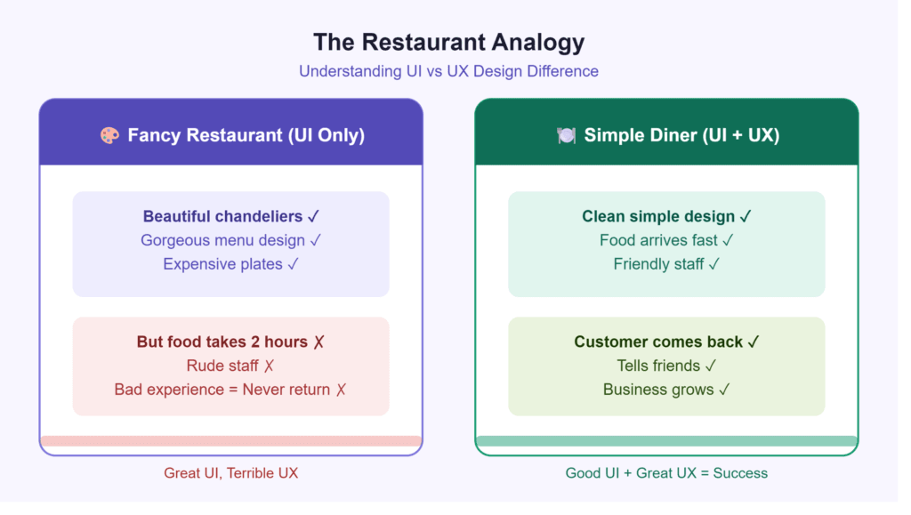
Think of a Restaurant
Here’s how I explain it to clients who aren’t from a design background: imagine you’re going out to eat.
The UX the user experience is everything about that evening. Was the place easy to find? Did the menu make sense? Did your food arrive in a reasonable amount of time? Did you feel like you were taken care of, or were you just another table to turn over? That’s the experience of the whole thing, start to finish.
The UI the user interface is what the place looks like. The lighting, the fonts on the menu, the way the chairs feel, the colors they chose for the walls. All the visual stuff.
Now here’s the thing. A restaurant can be absolutely stunning beautiful interior, gorgeous menu design and still be a miserable place to eat at. Slow service, confusing ordering process, food that arrives at the wrong time. On the flip side, some of the best meals happen in places that look like nothing special. A plastic table, a handwritten sign, fluorescent lights and the food and service is just right.
The best places nail both. That’s the goal with digital products too.
So What Does UX Actually Involve?
UX design User Experience Design is really about figuring out how a product works from the perspective of the person using it. Not from the perspective of the person who built it, not from the CEO’s point of view. The actual user.
A UX designer’s job involves asking things like:
- What is this person actually trying to get done right now?
- Where are they likely to get confused or just give up?
- Is there a shorter path to where they need to go?
- Are we assuming our users understand something they probably don’t?
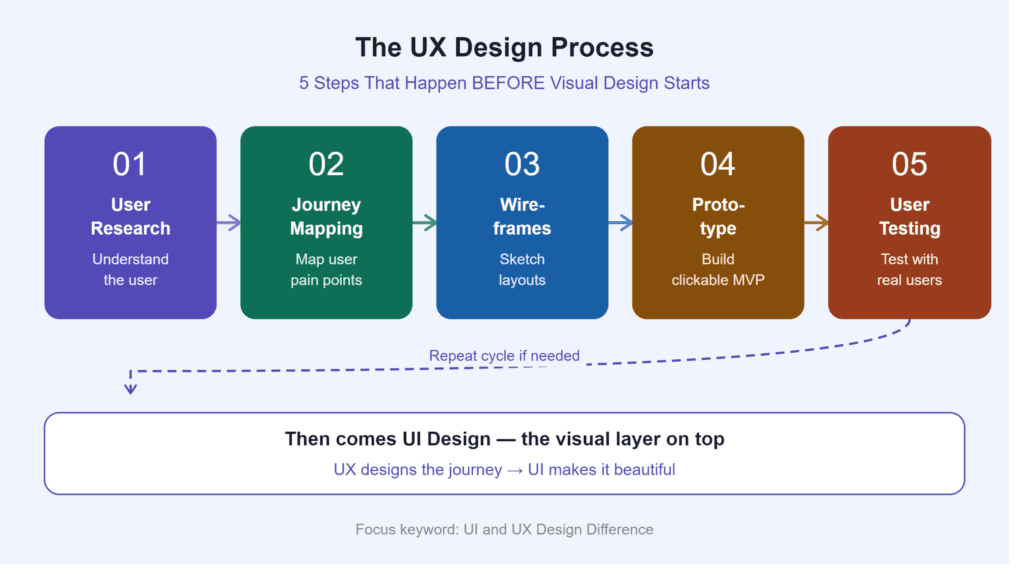
Most of this work happens before anyone touches a visual design tool. It’s research. It’s talking to real users. It’s sketching out wireframes rough, almost ugly diagrams that show how a flow works without worrying about how it looks yet. It’s testing those flows with actual people before you build anything expensive.
When UX is done well, you don’t notice it. That’s kind of the whole point. Think about how natural it feels to look for a place to stay on Airbnb. Or how you can find a song on Spotify in about three seconds without thinking. Nobody sat down and got lucky with that. It took years of watching how people use these products, figuring out where things went wrong, and fixing them. That’s UX work.
And What About UI?
UI design User Interface Design is the visual layer. Buttons, colors, typography, spacing, icons, the tiny animation that plays when you tap something. Everything the user can see and touch.
A UI designer is thinking about questions like:
- Does this button actually look like something you can click?
- Can someone read this text on a phone screen outside in the sun?
- Does this color palette feel trustworthy or does it look like a scam?
- When a page loads slowly, does the experience feel broken, or does it handle it gracefully?
This is where your brand personality shows up in the product. Two apps can do the exact same thing. One looks polished, considered, and worth paying for. The other looks like it was thrown together over a weekend. That gap is almost always a UI problem and it matters more than most people realize.
Research from the Stanford Web Credibility Project found that 46% of users’ credibility assessments are based on visual design elements like layout, color and typography not content, not what the site offers. Just how it looks. They form that opinion in just 50 milliseconds, 0.05 seconds.
UI vs UX: Side by Side
| Category | UX Design | UI Design |
|---|---|---|
| What it covers | How the product works | How the product looks |
| The main question | Is it easy to use? | Does it look right? |
| What gets produced | Wireframes, user flows, prototypes, research | Visual designs, style guides, UI kits |
| Which comes first? | Always it sets the foundation | Follows UX decisions; built on top of them |
| Common tools | Figma (flows), Miro, UserTesting | Figma (visuals), Adobe XD, Principle |
| How success is measured | Task completion rate, drop-off points | Visual consistency, brand alignment |
Both sides of this matter. Solid UX without good UI feels unfinished and cheap. Great looking UI on top of broken UX won’t convert anyone.
The Numbers Behind This It’s Not Just Theory
I know it’s tempting to treat design as the fluffy part of building a product. It’s not.
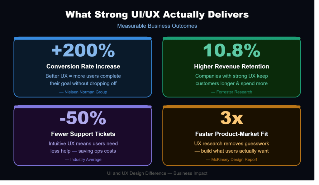
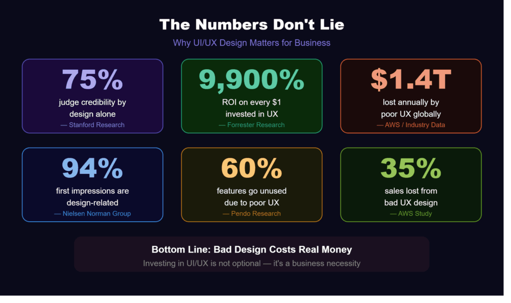
Amazon Web Services published a report showing that businesses lose 35% of potential sales because of poor user experience. Globally, that adds up to something like $1.4 trillion in lost revenue every year. That’s not a rounding error. That’s the size of entire economies.
Forrester Research which tracks this stuff closely found that every dollar put into UX brings back around $100. That’s roughly a 9,900% return on investment. I’ve never met a CFO who would turn that down if they actually understood what they were saying no to.
And the UI side? Research from Northumbria University showed that 94% of first impressions are design related, not content related. People aren’t reading your headline first. They look at your product, decide whether it looks legitimate, and either stay or leave. All before they’ve read a single word.
These numbers hold across industries. It’s not just tech startups. Healthcare, finance, e-commerce, SaaS doesn’t matter. Bad design costs money.
Where Most Companies Go Wrong
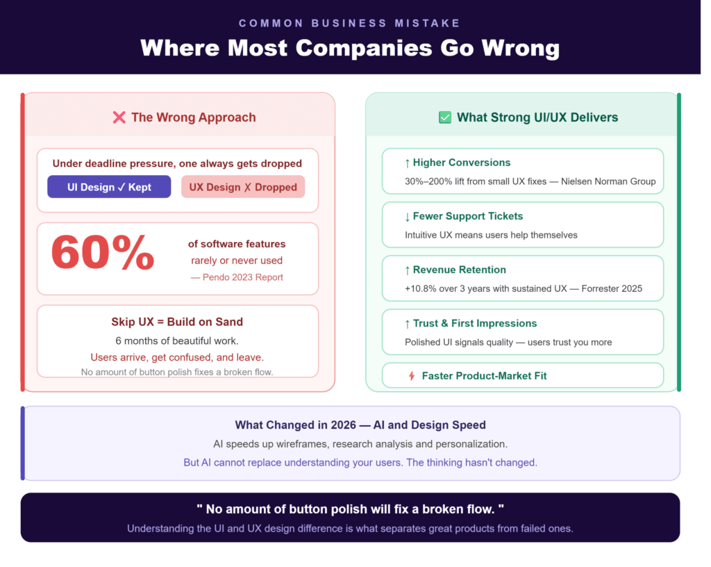
Here’s what I see over and over: a company posts a job for “a UI/UX designer” and treats it like one thing. Sometimes that works. Usually it doesn’t, because understanding the UI and UX design difference requires different skills, and the two things pull your brain in different directions. Under deadline pressure, one of them gets dropped.
The one that gets dropped is almost always UX.
It makes sense, in a way. UX output doesn’t look impressive. Nobody hangs a wireframe on the wall. Nobody shares a user journey map on LinkedIn and gets 200 likes. But that wireframe is where you decide whether the product actually makes sense for the people who’ll use it. If you skip that part, you’re building on sand. This is exactly why the UI and UX design difference matters more than most businesses realize.
The pattern plays out constantly. A team spends six months building something that looks incredible at launch. Users show up, can’t figure out how to do the one thing they came to do, and leave. That’s not a visual problem. No amount of button polish will fix a broken flow.
Pendo’s 2023 Product Benchmarks report found that 60% of software features are rarely or never used. That’s not wasted design work that’s wasted engineering budget. Months of developer hours building things nobody needed, because someone skipped the user research step.
What Changed in 2026 AI and Design Speed
AI tools have genuinely changed the pace of early-stage design work. User research that used to take weeks to analyze can now be processed faster. You can generate and test wireframe variations in hours instead of going through three rounds of stakeholder meetings. Personalization showing different interface states to different types of users is now something smaller teams can actually pull off.
But the thinking behind it hasn’t changed. AI speeds up execution. It can’t replace understanding your users. You still have to do the research. The user journey still has to make sense. The visual language still has to match what your brand is actually about.
At DeCodeS Tech, we combine AI-assisted design tools with traditional UX thinking so products move faster without cutting corners on the parts that actually drive results.
What Strong UI/UX Actually Delivers for Your Business
If you’re still thinking of design as a cost center, here’s what you’re probably leaving on the table:
- Higher conversions. When a flow makes sense and the CTA is in the right place, more people complete purchases or sign-ups. Nielsen Norman Group research shows small UX fixes repositioning a button, shortening a form can lift conversion rates by 30% to 200%.
- Fewer support tickets. When users can figure things out on their own, your support team handles less volume. That’s real cost savings.
- Better first impressions. A polished interface tells people you take quality seriously. That influences whether they trust you enough to hand over their credit card.
- Better retention. People come back to products that feel good to use. Forrester’s 2025 research shows sustained UX investment can improve revenue retention by up to 10.8% over three years.
- Faster product-market fit. Good UX research surfaces wrong assumptions early before they become expensive mistakes baked into production code.
What to Actually Look For When You Hire
Whether you’re vetting an agency or a freelancer, a few things actually separate good from not-good:
They ask about your users before talking about deliverables. If the first thing someone shows you is their portfolio without asking who your users are or what problems they face, that’s a red flag. A beautiful portfolio doesn’t tell you whether they can solve your specific problem. This is where the UI and UX design difference becomes immediately visible a purely visual thinker will jump straight to screens, while someone who truly understands both will start with questions.
They show you process, not just final screens. Ask for a case study a real problem, the decisions made along the way, what happened after launch. Anyone can screenshot a nice Figma file. Fewer people can walk you through why they made the choices they made. Understanding the UI and UX design difference means knowing that the thinking behind a design matters just as much as how it looks and a strong designer will always be able to show you both.
They treat UX and UI as connected, not separate buckets. Even when different people handle each part, the handoff needs to be seamless. A beautiful design built on top of a confusing user experience will underperform. Every time. The best designers and teams you will work with are the ones who have fully internalized the UI and UX design difference they know exactly where one ends and the other begins, and they make sure nothing falls through the gap.
How DeCodeS Tech Works
At DeCodeS Tech, our product design work covers both sides of this from understanding what your users actually need, all the way to building interfaces that reflect your brand and turn visitors into customers.
We’ve worked with startups and growing businesses across the USA, UK, UAE and worldwide. Every project starts the same way: with the people who’ll use the product, not with what looks nice in a portfolio.
If you want to build something that works well and looks good doing it, get in touch for a free consultation or explore our full range of digital services to see how we can help.